Welcome to the New Era: Russian Hill Neighbors Unveil Fresh Branding
We’re thrilled to introduce the new visual identity for Russian Hill Neighbors! After months of dedicated effort, creative exploration, and valuable community input, our new branding is ready to represent the vibrant and dynamic spirit of our neighborhood.
A Modern Touch to a Classic Symbol
The journey began with the intention to modernize the long-standing RHN logo while honoring our roots. Our previous logo, a nostalgic nod to the firehouse where RHN meetings were held, carried a historic and classic feel. But as times change, so does our need to stay relevant and visually appealing.
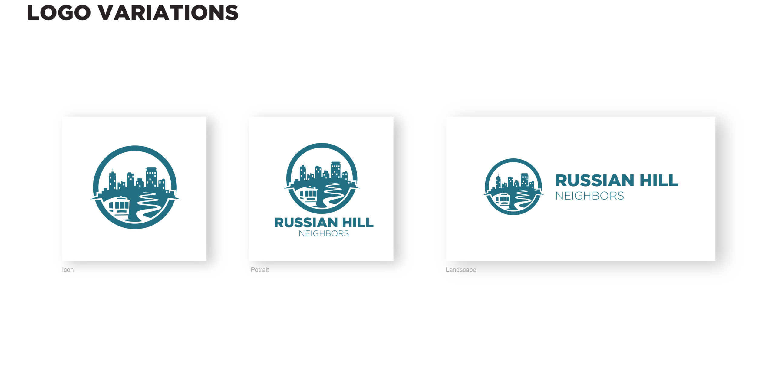
Led by our Marketing Chair, Danny Wohlner, and backed by a talented professional designer, we embarked on this creative venture. After engaging with the community through surveys and understanding the essence of what Russian Hill means to everyone, a consensus emerged. The new logo incorporates key elements that are synonymous with our area: the iconic hill, cable cars, and the famous Lombard Street, all wrapped in a clean, modern design.
Design Features That Speak Volumes
The new logo is simple yet profound. It features a circular boundary that draws the eye inward, focusing on well-known symbols of our neighborhood crafted in striking ‘Bay Blue.’ This color not only represents the picturesque views of the water seen by our residents but also embodies trust and tradition. The use of a modern Gotham font for the text ensures clarity and immediate recognition, inviting viewers with its friendly and approachable style.
Flexible and Functional
Understanding the diverse needs of digital and print media, we’ve developed three logo variations: Icon, Portrait, and Landscape. Each format is tailored to maximize impact and maintain legibility across different platforms and sizes. This flexibility ensures that our new logo can adapt effortlessly, whether it’s on a website banner, community flyer, or promotional material.
Brand Guidelines for Cohesive Communication
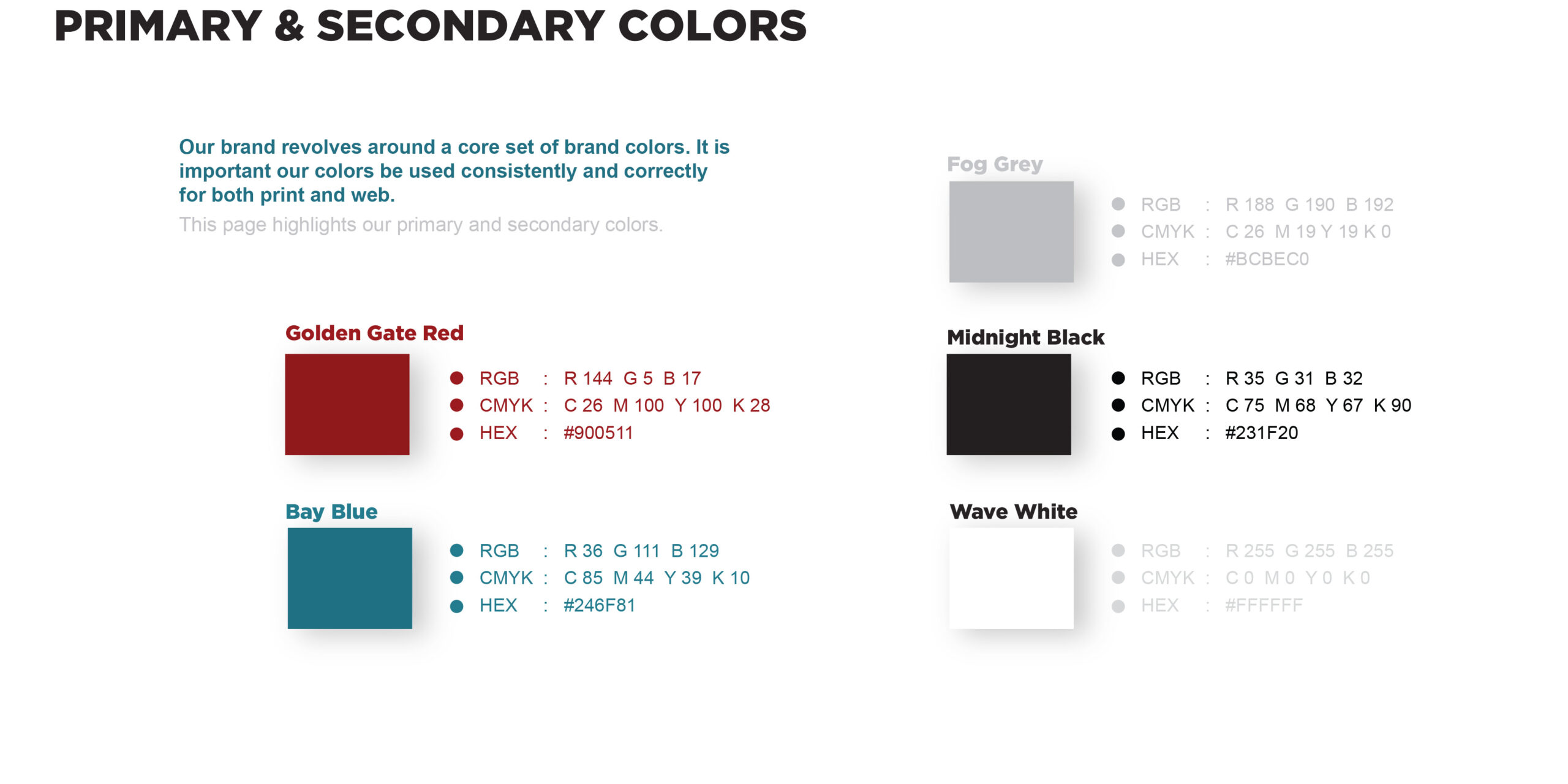
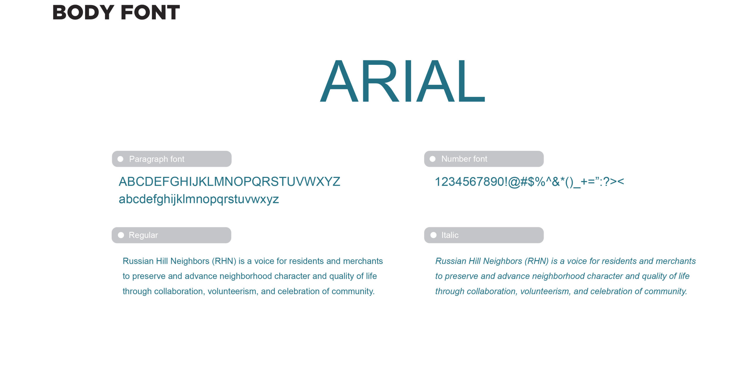
To maintain consistency and uphold the integrity of our new brand, detailed guidelines have been set. These include the proper usage of our primary and secondary color palettes, typography specifications, and best practices for applying the logo across various media. Our secondary colors—Golden Gate Red, Fog Grey, Midnight Black, and Wave White—provide additional options for creating hierarchy, contrast, and visual interest in our communications.
Looking Forward
This rebrand isn’t just about a new look; it’s a reflection of our ongoing commitment to foster community spirit and engagement. As we move forward, the updated branding will serve as a beacon of our collective identity and values, reinforcing our mission to preserve and enhance the quality of life in Russian Hill through collaboration, volunteerism, and celebration.
We invite all neighbors and friends to embrace this new chapter with us. Let’s continue to build a connected and thriving community, proudly represented by a brand that truly reflects who we are.
To see the full brand guidelines and explore the new logo in detail, check out the link below.


I look forward to receiving the Russian Hill Newsletter.
Looks fine1